You Print a low-cost printing house that has become one of the regional leaders in its market area. As a full-cycle production company, it has the necessary technical base to perform tasks of almost any specificity and complexity, from leaflet production to hardcover book printing and souvenir production.
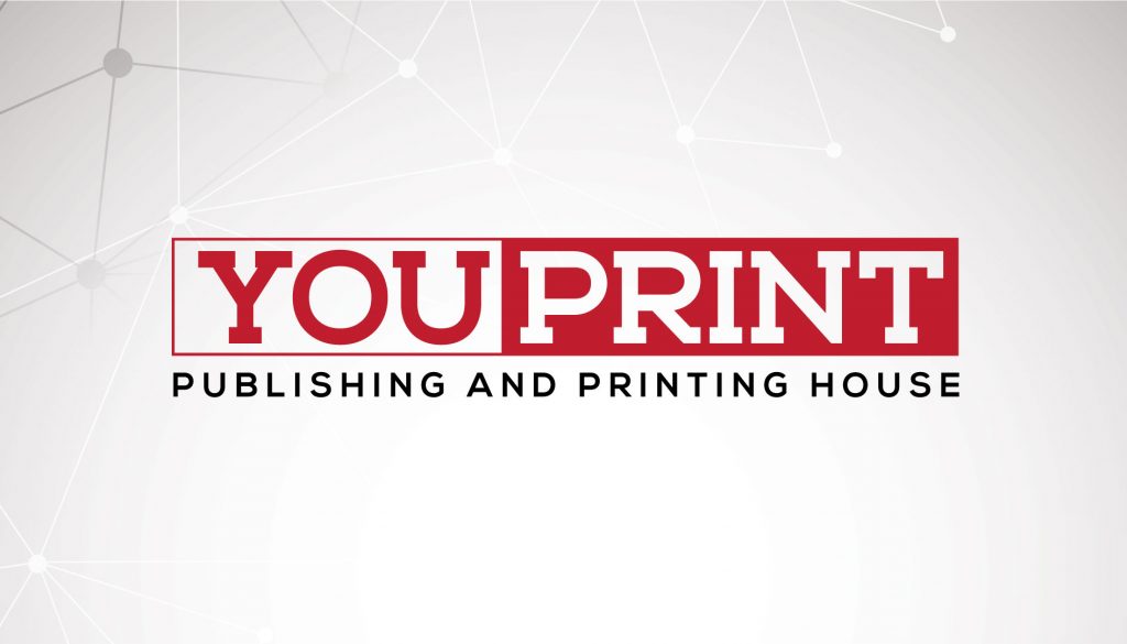
This logo consists of two words and was divided into two parts, written in the middle of the booklet. The font used on the logo is bold, with serifs and letters almost fitting into a square, which allowed even more emphasis on the rectangular shape of the entire logo. I’ve chosen red as a primary color, but the main thing in this logo is shapes, so the logo’s color will vary depending on the background color.
Wall sign on You Print office building

Promotional stationery items designed for You Print


