Alta Bank is a new banking structure that has taken the path of merging and reorganizing three smaller banks. The new organization has three main business areas: providing services to the population, supporting small and medium-sized businesses, and its investment programs in various local and development projects. The company has an aggressive upgrowth strategy and a desire to stand out from the competition.
Therefore, in the logo, it was necessary to convey the power of three and openness to cooperation! The best version of the logo was found after several iterations. These three open cubes combined to express the unity of new partners, focus on three main areas of activity, and openness to cooperation and innovation. Red was chosen as the primary color, which is somewhat unusual for a financial institution but adheres to courage, aggressiveness, and innovative solutions.
Wall sign on Alta Bank building

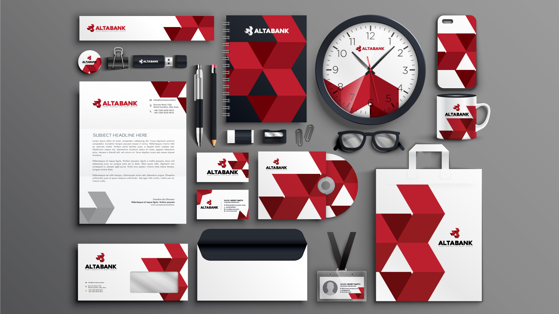
Promotional stationery items designed for Alta Bank


